Good design is the business
Creating a coherent ecosystem of creative assets is like conjuring. From the primordial mix of posture, language, cultural context, purpose, and process, I draw out the aesthetic that captures the essence of the thing. These images are episode designs for Yale Center for Faith and Culture’s podcast “For the Life of the World.” It is my job to hear the transcript, then listen beneath the words, and finally create a snack of art that holds the meaning and gesture of the content.
In addition to designing the accompanying artwork, I researched up-to-the-second best practices for social media engagement unique to podcast audience development, with a particular focus on Instagram and LinkedIn.
Soulforce, a multi-issue LGBTQI organization, sabotages Christian Supremacy from its rootedness in the U.S. South while organizing in solidarity with the Global South. I worked there from 2005 to 2019.
At Soulforce, we take weaponized Christianity very seriously. At times, we became mired in the sticky language of the religious and political structures that we targeted. Were we against “conservative” religion? Too loaded. Too geography-specific. Were we anti-religion? Hardly, but neither we were invested in denominational politics or restoring Life of the Church.
Layer on the fact that we were, as an organization, religiously astute and spiritually attuned, but not religious per se…and we found ourselves in need of re-shaping the rhetorical structure of our field. We found our freedom and focus in developing and disseminating the concept of “Christian Supremacy.”
This precision wording contoured that which we were against: ideological and structural violence robed in Christianity. The incisiveness of this thought form peeled away Christianity from the true problem and allowed us to fully and freely unleash the force of our organizing with creativity and power. Instead of adjudicating “good” from “bad” Christianity, we exposed the underpinnings of problem that was hiding in plain sight.
To complement this rhetorical evolution, I worked with a team to develop a new brand aesthetic to evoke the sharp/tender paradox of caring for people harmed by Christian Supremacy while challenging that harm without apology. We pulled from cornerstone Christian concepts like the Serpent and the Dove to locate ourselves within the conversation and bar our adversaries from framing us as outside agitators.
When working on complicated, human-centered problems, I find it useful to name the theological ideas (or ideas that function theologically) that are holding the challenge in place. Structures of belief can operate below the surface, making us less receptive to new ideas or unaware of why we are attracted to some solutions and resistant to others. Theological ideas don’t have be doctrinal or scriptural; they can be abstract stances on goodness, worthiness, wholeness, labor, resources, relationship, and more.
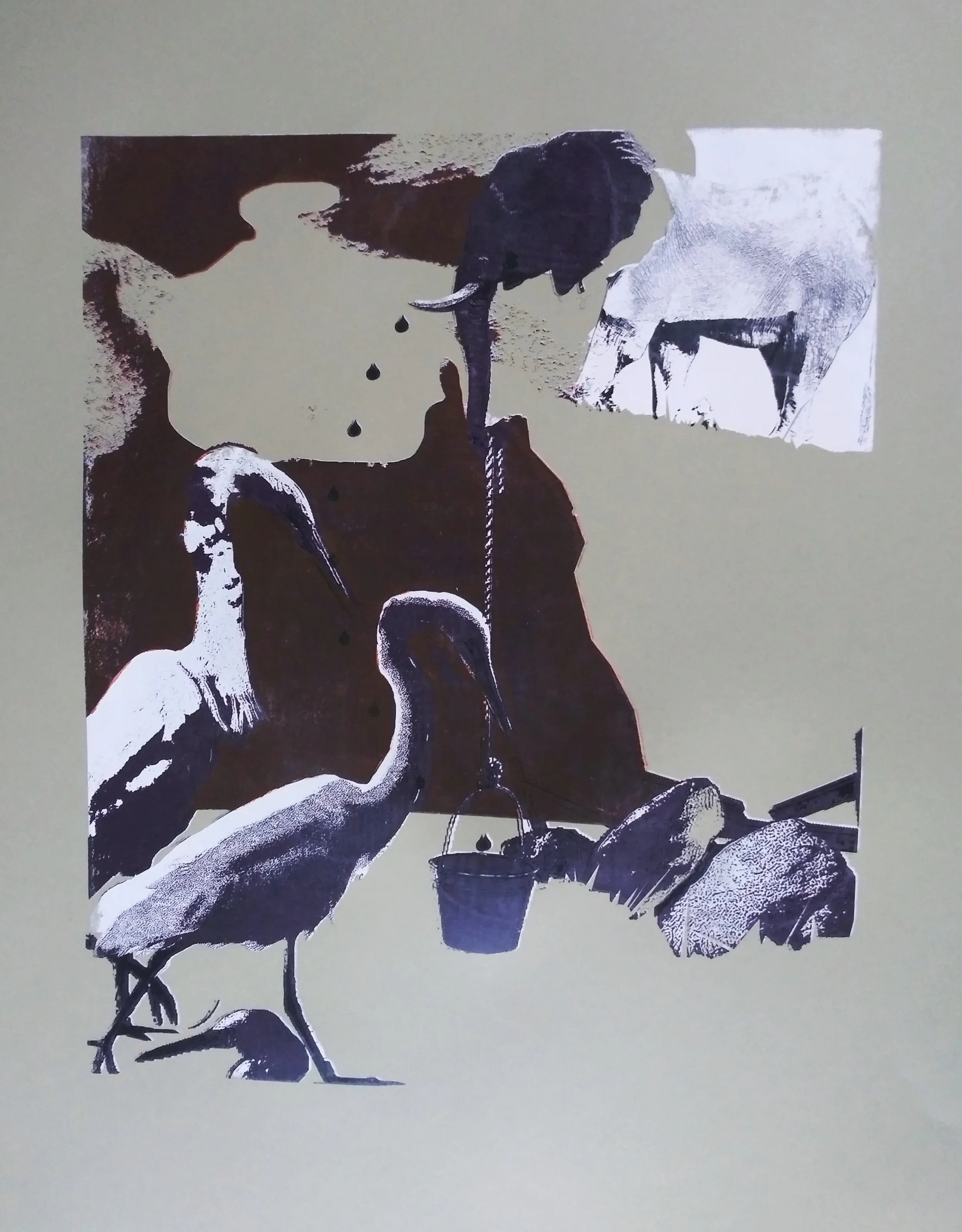
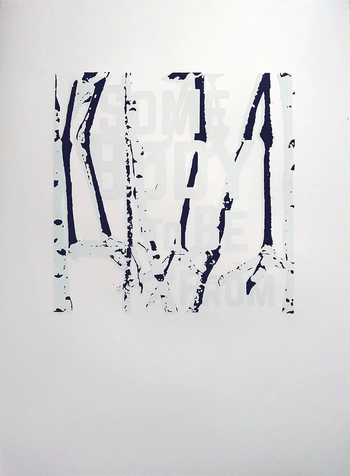
This project, Jesus Didn’t Have a Board of Trustees, came out of that desire to illuminate the theological within. I began this screen printing/writing project at the Harvard Seminar on Sexuality a few years ago, and I have continued to add to it while at Yale Divinity School. Using elephants as the main character and other fauna as needed (Papal Bulls? The pictures write themselves!), I am telling the story of the imbrication of European Christianity and economic empire. Themes of land, ownership, embodiment, spatio-temporal control, and divine manipulation abound.
Through this work, I solve again and again how to deliver complex, (sometimes) uncomfortable, necessary ideas in a way that they can be received and engaged.
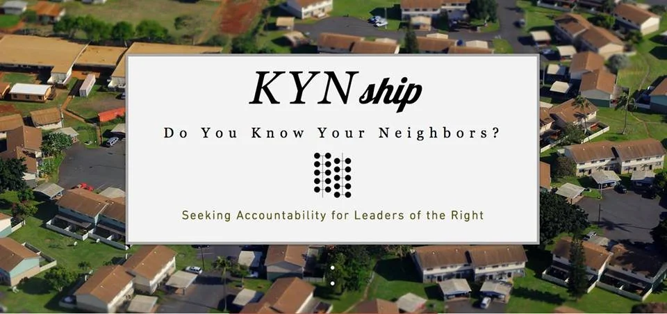
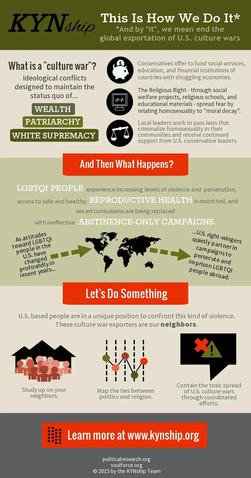
The Know Your Neighbors campaign was a cooperative project between Soulforce, an LGBTQI organization focused on the Religious Right, and Political Research Associates, a think tank that researches right wing ideologies and formations. Our two organizations joined to make opposition research more accessible and to expose the U.S. fundamentalists who export U.S.-style culture wars to the Global South.
This collaboration required developing a sub-brand that our organizations could embrace and our audiences, current and potential, could relate to—meaning not overtly religious. Drawing on rigid utopian ideas about suburbs that developed in tandem with the rise of the (white) Religious Right in the U.S., I provided a simple, bold logo that references the cul de sac, which could flex across social media, toolkits, and swag without disrupting our organizations’ core branding. With a lean but precise style guide, my teammates could also contribute to the creative assets, such as the infographic by my comp@ Yaz.
Around the time of Soulforce’s 15th anniversary, we had a data migration problem and a relationship problem. When we invested in updating our technology platforms, we found that our old website was too outdated to work with and too unwieldy to transfer due to data-rich photo documentation of dozens of member-led campaigns since 1998. That left our founding members wondering if they were a part of the evolving vision of the organization when they could no longer see their memories with ease.
Pinched between honoring the foundations of our organization and needing to integrate more advanced functionality, my solution was to create a data-light interactive timeline scaffolded on the most treasured memories of our legacy members. I created this mailer using visual and rhetorical themes of yeast, bread, and intergenerational relationships. Members were asked not to give money but to share with us their stories.
This solution centered those who made our organization possible, celebrated our history, and pointed toward a future grounded in some baton-passing and some hard-won wisdom sharing.
These images represent a peak feedback loop between campaign execution and community development. The doves featured on these digital greeting cards were a part of the “Living Altar” that anchored our intervention at the National Religious Broadcasters annual global conference. Based upon our analysis of right wing media, the NRB’s channels claim the largest audiences in radio and television and funnel the most well-resourced and spiritually violent programming from the United States to the Global South.
Hundreds of doves sent in from around the world to honor those lost in the Pulse Nightclub massacre in Orlando were used to construct our three-day action at the NRB conference inside the largest Marriott hotel in the world in April 2017. In June, we featured those same doves in a greeting card marketing campaign that empowered our members to share joy with their friends and tell them about the work of Soulforce in the process.
Soulforce fills a unique role within the global LGBTQI movement: empowering people with non-doctrinal and accessible theological research on feminism, sexuality, gender, and embodiment. A lot of the liberating scholarship on these matters is buttoned up in the English language and/or the Academy. Put otherwise, people without access to elite educational institutions, English language skills, or the de-coder ring for western scholarship stylings have to invent the wheel for themselves.
While we esteem contextual theologies and recognize that the western way is not the only way (indeed, the prevalence of the western way is part of the origin story of so much gender-based violence), U.S.-style Christian Supremacy is taking root around the world faster than the tools to combat it are being shared. Enter our library of theological booklets.
Our multi-front challenge was:
1. We needed a flexible aesthetic that could shape-shift well into the future.
2. We needed it to have pizzazz but still be cost-effective.
3. We needed printing specs that were easily replicable, whether booklets were produced in NYC or Johannesburg.
4. We needed the booklets to look innocuous.
5. We needed the design to be easily changed to respond to local culture, symbolic meanings, languages, and platforms (paper vs. smartphone) in order to protect the safety and confidentiality of our audience.
Specifying kraft paper, black ink, and a rotating array of flowers, doves, snakes, and organic patterns bridged our organization’s brand with the library’s continuous aesthetic that is future-proofed and adaptive.
I experience my art practice as an act of giving because it comes from a place of joy. Creation is transcendental, y’all.
As such, I regularly take on pro bono and low-cost design jobs: to support their first book publication, to juice up their new Trans film festival, to aggregate an identity for marginalized folks entering into an unwelcoming space at the United Nations, to welcome an incoming class of students arriving during the pandemic. It is so satisfying to give more shape, weight, and life to someone else’s creative energy.
I love a riot of colors and shapes and textures.
I tend to work on larger paper and canvas. I am also a huge—HUGE—fan of site-specific installations and devised artistic experiences. I enjoy pulling people into a narrative, whether it’s paint or dance or a sound-based ritual.
There is a storyteller in me. I weave worlds with words and images and movement.